Redesigning the Knowledge Hub
From Information Overload to Seamless Navigation: an internal knowledge hub for employees to consolidate all knowledge sources into one user-friendly interface.
My role
-
UX Design
-
UI Design
-
Instructional Design
Teams involved
-
Learning team
-
"Zoomin" company
-
Salesforce team

Some context
Our internal knowledge hub was underperforming, with outdated content and confusing navigation. As a product designer, I spearheaded a user-centered redesign that boosted engagement and user satisfaction by X% and streamlined content discovery.
The Problem
-
The content was outdated and irrelevant
-
Navigation didn’t reflect business needs
-
Users struggled to filter and locate content efficiently
-
All of this, and more, led to very low engagement with the platform.
Why it matters?
A major concern among employees has been the absence of reliable information sources within the company for years.
This results in:
-
Client dissatisfaction
-
Wasted time searching for information
-
Challenges in determining if found information is up-to-date
Research: Diving Into User Needs

Survey

Focus groups
.png)
Usability tests

Interviews

Market research
Have you heard about the new Knowledge Hub, and have you had the chance to use it so far?
When searching for an answer to a professional question, what are the primary sources you typically consult for a solution?
How do you think it would be more convenient for you to filter information in the search engine based on your current search habits?
When looking to learn something new that you haven't dealt with before, where do you usually search for the answer?
When searching our databases, do you usually know which document you are looking for, or do you search by topic, hoping to find the answer somewhere there?
Do you see value and would you be interested in uploading documents (guidelines/best practices/other) that your teams use daily to the hub, so they are centralized in one place with the rest of the team's documents?
On information searches of this kind, how important is it for you to receive an estimate of the document's reading time before entering it?
how would you rate the ease of use and accessibility of the new knowledge hub for finding relevant information compared to the previous methods?
Survey
how often do you find the information in a written form within our databases (as opposed to receiving an explanation from one of your colleagues)?
When searching for information/explanation/presentation to send to your client or prepare for a presentation, where do you usually search at?
how helpful is it for you to know which articles are most read by your colleagues?
Are there specific challenges or obstacles you face when using the knowledge hub that you would like to highlight?
how helpful is it for you to know about the latest articles uploaded to the hub?
Sruvey
Key insights
57% of the participants in the survey were familiar with the hub but hadn't used it yet.
(the hub was live for 6 months at the time the survey was conducted).
78% of the participants felt it would be more convenient to filter information based on product type.
3 was the average rating for the ease of use and accessibility of the new knowledge hub compared to previous methods, indicating poor performance for a tool.
Users primarily relied on Slack, email, or colleagues for answers, highlighting the lack of robust documentation and its neglect.
65% mentioned the inability to download information from the hub as a drawback. Since the hub was designed as an internal tool, we initially assumed this feature wouldn't be necessary- a misconception that proved to be incorrect.
Interesting quotes
Omer K, Account manager: "Downloading external case studies (decks) to share with the clients. Can't find an option to do that on the tool?"
Tatiana M, Partnerships Team leader: "Tags and filters should have full coverage, also, not all documents are there"
Ido L, Product Manager: "Organized process of uploading materials and verifying them, ability to comment on materials (to correct/ improve/ ask a question)"
Usability tests
To evaluate the tool's daily usability and identify pain points in the user experience, we conducted a user-centered study. Together with users, we developed a task page featuring real-world search scenarios based on their daily workflows and typical reliance on existing organizational knowledge sources. The objective was to conduct live usability testing, observing their navigation and interaction patterns with the interface, assessing the efficiency of their search behavior, and verifying if they could locate the required information (ensuring the hub contained the relevant answers to their queries).

Observations from the tests:
-
Minimal to No Use of Advanced Search and Filtering Options – Partly due to differences in system behavior compared to Google and other search engines.
-
Lack of up-to-date documentation- Documentation was neither comprehensive nor easily accessible.
-
Poor User Experience with "Google Slides" View- Poor navigation and lack of details.
-
Inability to Search Within Files- Unlike in Google Slides, users couldn’t use CTRL+F to search for specific information within a file.
-
Missing Document Ownership- The lack of a clearly designated owner for each document made it unclear who to contact for updates or clarifications.
Interviews and focus groups
12
Focus groups
3
In-depth interviews
We conducted 12 focus groups and 3 in-depth interviews to explore current knowledge search and management practices within the organization, pain points, and expectations from a solution like the Knowledge Hub, which is designed to bring innovation and solutions to this domain.
-
Business Teams (Sales)
-
Product Teams
-
Growth Teams – Supporting the business and serving as intermediaries between business and product teams.
Key takeaways
-
Scattered & Outdated Information – Product knowledge is fragmented across platforms, with outdated or inconsistent documentation causing confusion.
-
Lack of Ownership & Structure – No central owner ensures accuracy and unstructured content makes information hard to find.
-
Disconnected Systems & Data – Dashboards and tools are poorly organized, making navigation and insight extraction difficult.
-
Terminology & Cross-Team Misalignment – Inconsistent terms across teams create confusion, and limited collaboration leads to knowledge gaps.
-
Over-Reliance on Experts – Teams depend on a few individuals for deep product knowledge, risking bottlenecks and knowledge loss.
User persona

Design Process: Defining the Optimal Solutions
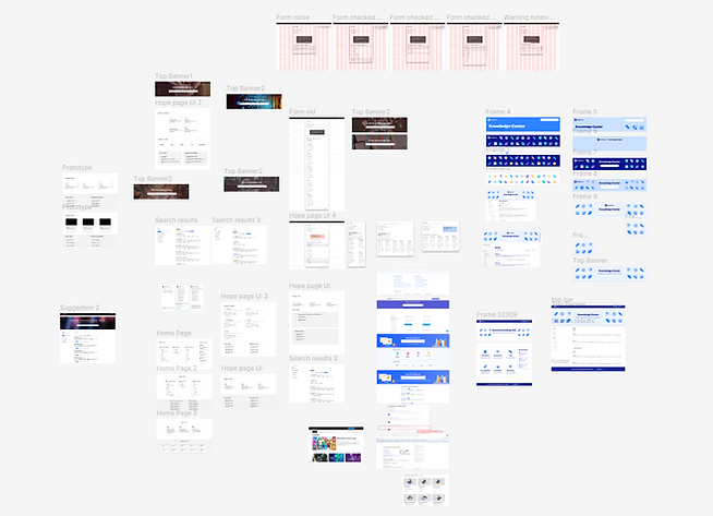
After conducting the research, we analyzed the data collected and mapped out the identified issues. We held a brainstorming session to explore potential solutions and selected the optimal ones, balancing user needs with the technical constraints outlined by the product teams. Additionally, we considered insights from the learning team regarding knowledge retention processes and prioritized them accordingly.
From the UI perspective, I had to focus on upgrading the UI because I was re-designing the hub, rather than starting fresh. To balance both originality and existing components, I had to construct my Design Style guide while also largely following Unity's design approach.
1. Outdated and Irrelevant Content
Problem: Much of the hub's content was outdated or irrelevant, leading to a lack of trust in its reliability.
Solution: We established a structured content approval process, including creation, professional review, and quarterly reminders to update content.
01
CREATION
SMEs (Subject Matter Experts) creates the documentation as part of their regular routine.
02
APPROVAL
They upload the content to the hub to get approval from the hub admin, who verifies that the content is eligible for inclusion in the hub.
03
QUARTERLY REMINDER
Every quarter, the SME receives an email reminder to update or delete their content.
2. Misaligned Content Categories
Problem: The content categories didn’t align with the company’s current business needs, making it harder for users to locate relevant information.
Solution: We reorganized categories to be product-focused rather than topic-based.
3. Limited Scalability for Personalized Information
Problem: The hub’s goal was to be the go-to place for all professional information, but some content was team-specific and couldn’t be centralized effectively.
Solution: We introduced Team Spaces, enabling teams to manage and access tailored content.
4. Static Content Experience
Problem: Users perceived the hub as outdated because there was no indication for updates
Solution: We added dedicated sections for "What’s New" and "Trending" to create a dynamic and engaging user experience. In addition, we added a "last updated" date indication on each doc.

5. Ineffective Filters
Problem: Usability testing showed that users rarely used filters, likely due to their complexity and redundancy.
Solution: We reduced the number of filters to simplify the experience. For future scalability, we proposed dynamic filters beneath the search bar, inspired by best practices from other platforms.
6. Limited File Identification in Results Page
Problem: Users struggled to identify file types (e.g., Google Docs, PDFs) and their origins on the results page.
Solution: We added file type icons (e.g., Google Doc, Slide, PDF) and a toggle to indicate the document source.
Results page
%20(1)_gif.gif)
7. Poor Experience with Embedded Documents
Problem
Viewing embedded Google Slides in the hub was clunky, prompting users to revert to the original file.
Solution
We improved the embedded file display with a sidebar menu and added a direct link to the original document for a smoother experience

_gif.gif)
8. Inefficient Content Submission Process
Problem: Knowledge contributors found it challenging to add content to the hub due to a cumbersome submission process.
Solution: We redesigned the submission workflow, simplifying it significantly.

Previous Design
_gif.gif)
Reassessing Engagement & Next Steps
While platform engagement improved in 2024, it still falls short of our expectations.
The August-September peak, reaching 63% of the target audience, highlighted potential, yet the overall usage patterns suggest room for growth.

Peaks were observed during key events like the relaunch and major content updates, but engagement was not sustained at the level we aimed for.

Re-launch
New feature enablment launch
Next Steps
-
Redefining KPIs – Now that we better understand real product usage and user behavior through analytics, we need to adjust our engagement benchmarks. Initial targets may have been too ambitious due to a lack of internal benchmarks for a closed, internal platform with a limited user base.
-
AI Integration for Smarter Search – To align with modern search standards and encourage daily usage, we should integrate AI-driven recommendations and personalization to enhance discoverability and relevance.
-
Embedding into Daily Workflows – Ensuring tighter integration with existing tools (e.g., Slack, internal dashboards) so users naturally encounter and rely on the platform in their daily routines.